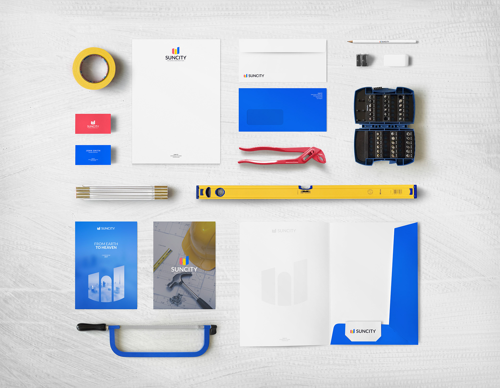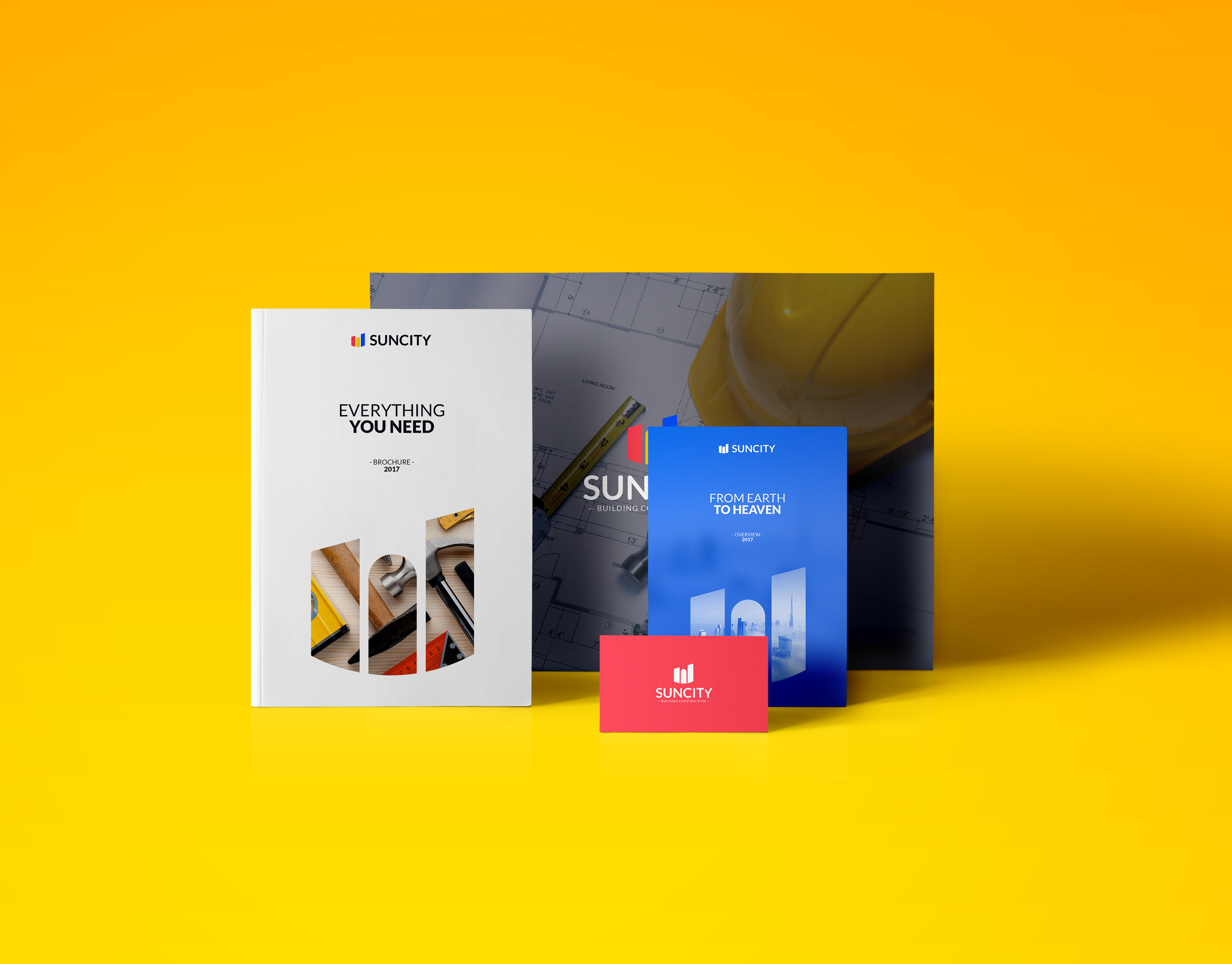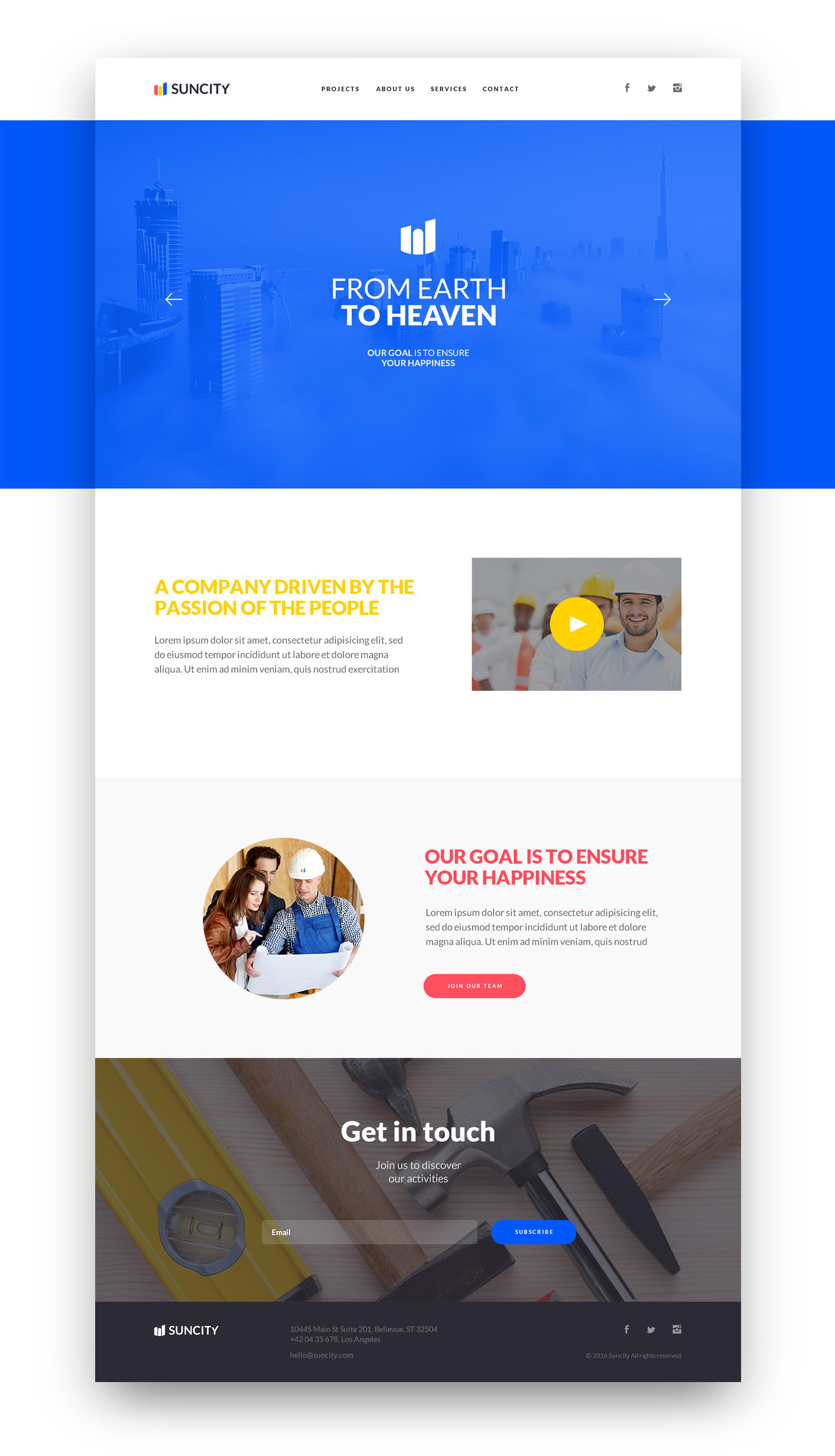

SUNCITY - BUILDING CONSTRUCTION
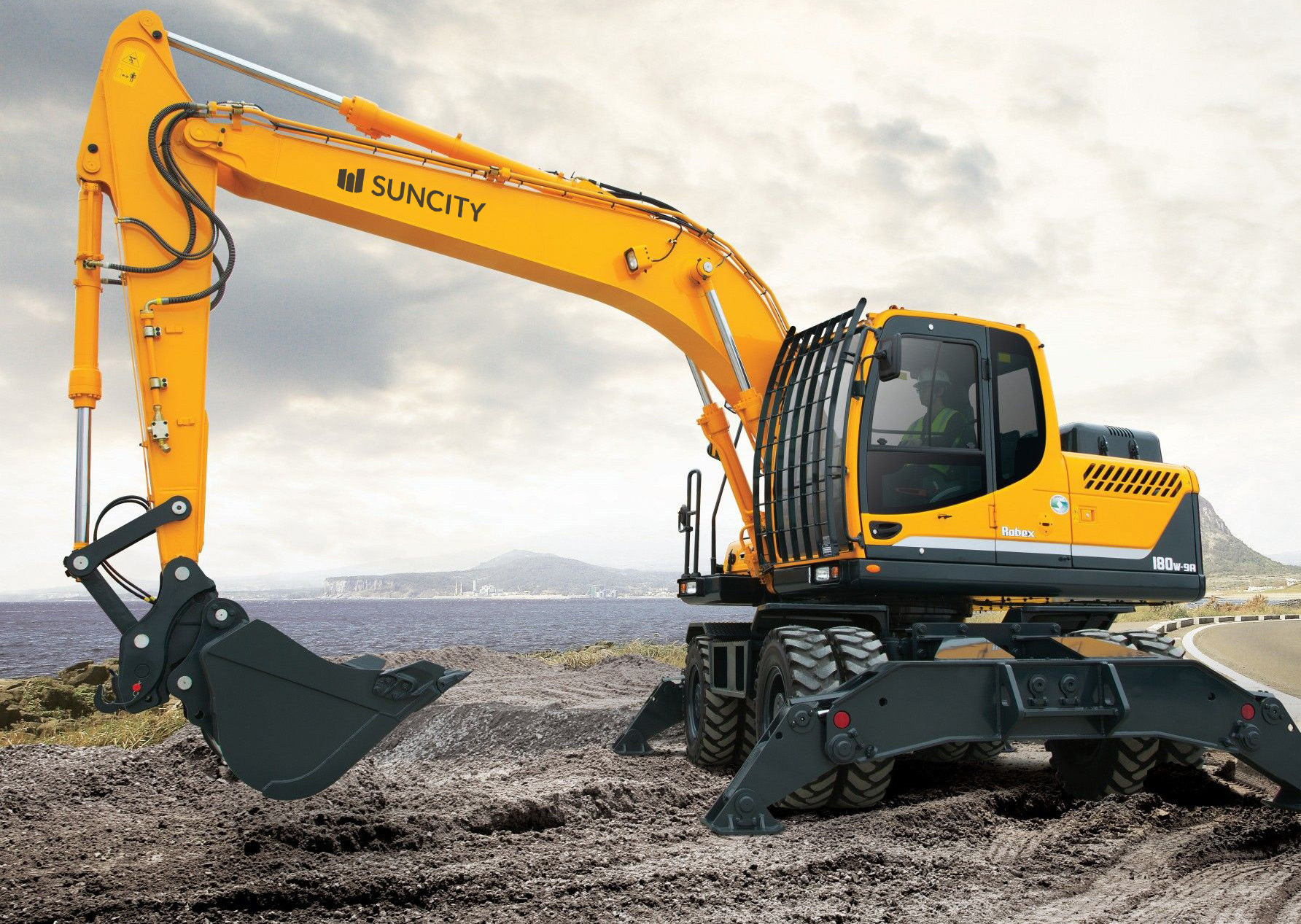
Suncity is a conceptual company that operates in the field of building construction. The project was born from a documentary I saw a few weeks ago about the construction of skyscrapers. I was fascinated and I decided to create a branding project for a potential company of this industry.
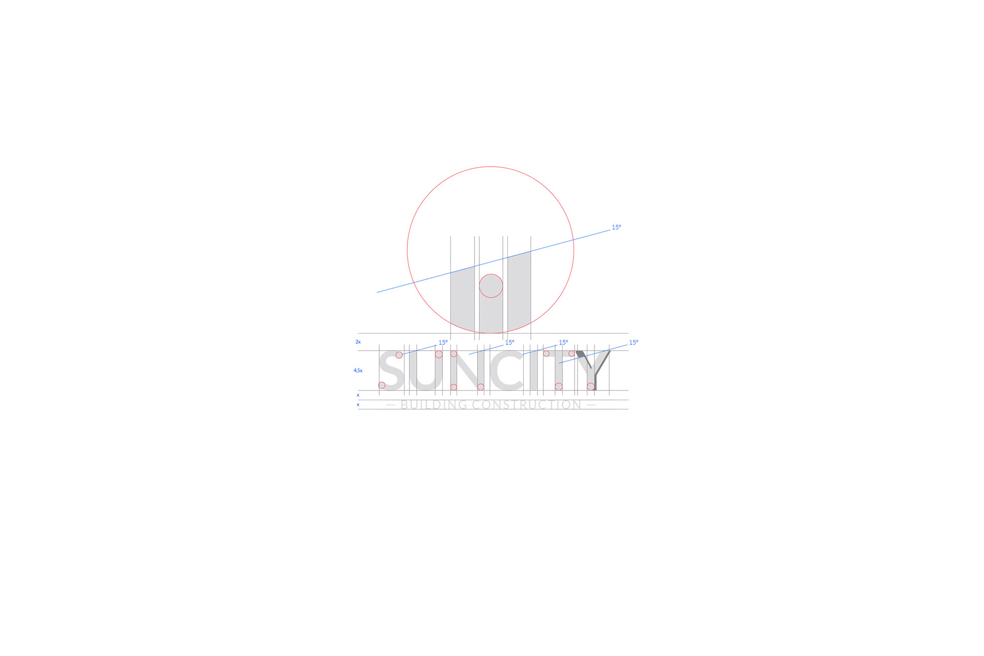
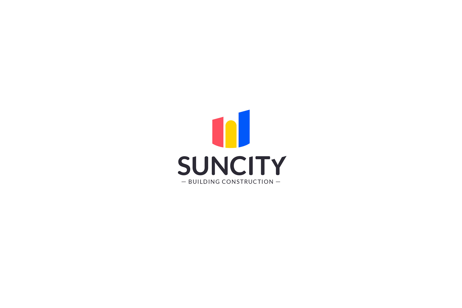
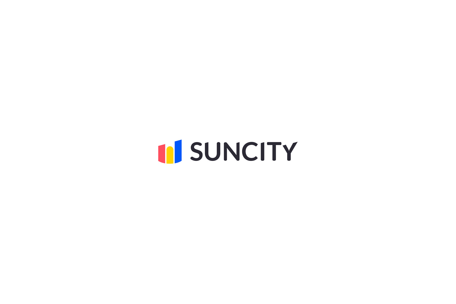
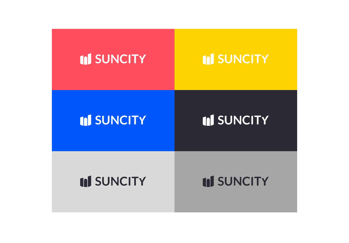
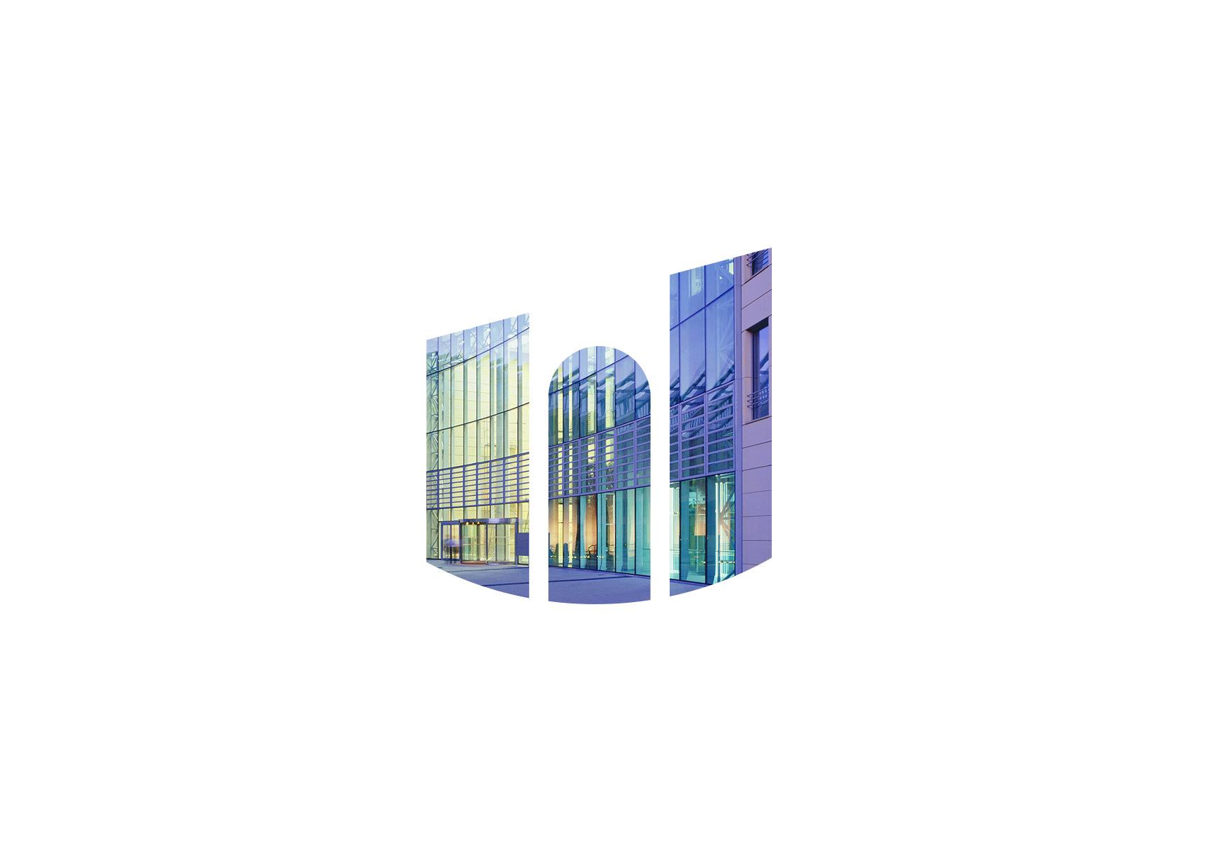
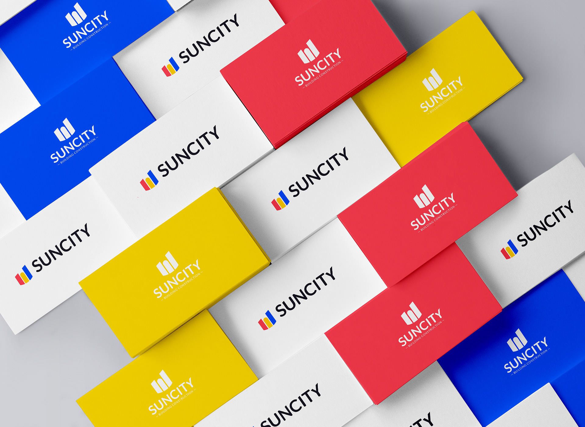
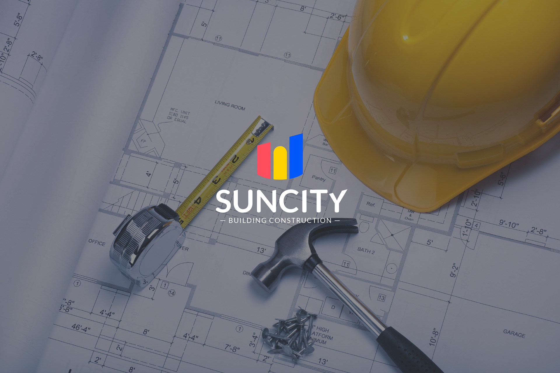
For this brand I decided to create a geometric and harmonious logo, with a simple but significant symbol. I designed some stylized buildings and I gave an oblique cut at the top that gives the feeling of progression, growth, advancement towards the future. The lower round cut gives a positive touch to the shape.
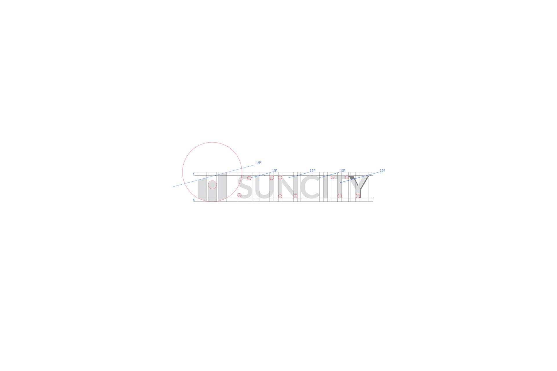
I also decided to customize the typeface of the logo. I have made some oblique cuts at some letters with the same inclination of the symbol and I rounded up a few detail again to resume the forms of the symbol.
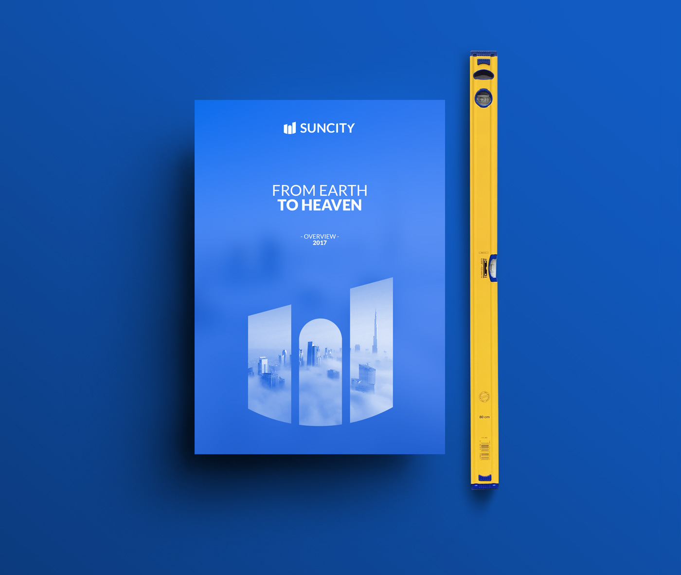
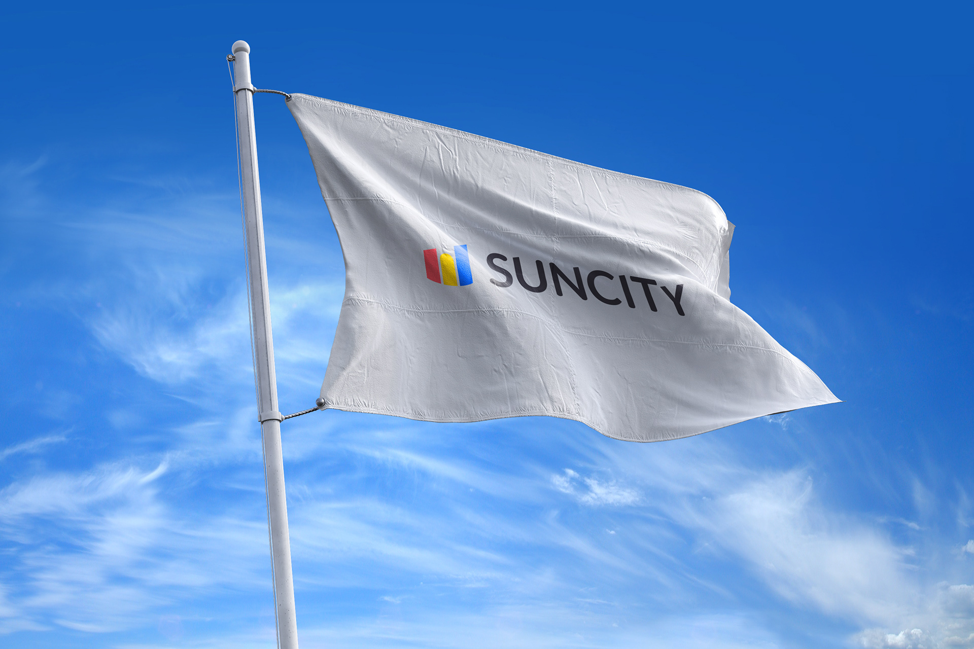
Finally I chose three colors, with three different meanings. The first color is the Red, which represents the basis, the foundation, the earth. Yellow is the material, the construction, the elements. Blue is the last color. It's the sky, the infinite, the future. Together and in that order they represents the transition from earth to heaven.